For the last 8 years I've been designing and developing web applications for my job. I love doing this and I think working together is the best way to create awesome products, but I've always been wanting to create an app on my own from scratch. However, I never really put much thought into what I wanted to build, nevermind actually building it. That all changed recently, and now, a few weeks later, I have my very own app available in the App Store and on Google Play.
How we got here - the reason why
I was listening to Afterhours FM (Electronic Dance Music, mainly Trance & Progressive) in my car, driving across the border between The Netherlands and Belgium. When doing so, the connection drops when switching between networks, which in turn interrupts the live stream. Annoying on it's own, but the page would also refuse to resume playback unless you hit refresh. Fiddling with your phone in a car mount on the highway is rather annoying, so the developer in me decided something had to be done, surely an app could do better.
Getting started
Working at my job, I have gotten some experience developing mobile applications using React Native. As such, also granting I hardly know any Java, no Kotlin nor Objective C or Swift, I figured this would be the easiest way to develop my app.
This choice immediately put me at a cross-road. Do I go for Expo Go or React Native. I decided that hearing a lot of good stuff around Expo Go recently, I'd give that a go. After all, all I really needed was a Play/Pause button to start/stop the stream and perhaps a notification, shouldn't be that difficult and right up Expo's wheelhouse right?
I intialised my app, got familiar with the setup and immediately got to instaling Expo Audio (part of Expo AV) and tried to play a livestream from AH.FM... And it failed. As it turns out Expo Go doesn't do livestreams, only direct files. Bummer. Guess I need react-native-track-player after all.
According to react-native-track-player's documentation, their library should work in Expo Go, though it's not actively tested in by their maintainers. I quickly found out that's not the case. After trying to get it to work either in an app or as web build for about an hour, I started looking through Github tickets. Only there I found out on multiple tickets that react-native-track-player does not support Expo Go. Back to square one, React Native, but this time without Expo Go.
First version - personal use
After switching to React Native with react-native-track-player, the road to a first version become a lot smoother. Within about 2 hours I had the project initialised, react-native-track-player installed and a button that could Play/Pause the live stream. Great succes!
Coming from a designer background, I wasn't just going to look at a white background with a gray button. I also at the very least wanted to know which show was currently playing. So I tasked Leonardo.ai, where I still had some free credits, with generating a nice background for me, grabbed an old Web 2.0 play button I still had from +- 12 years ago, and a method to grab fetch the metadata and threw it together. The very first version was a reality!
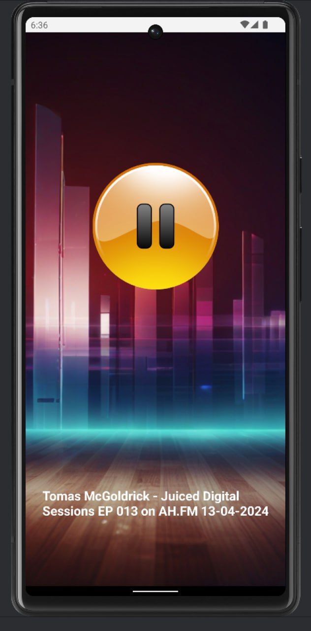
This left me wanting more. I knew their old app had the functionality to toggle the stream quality, and on their forum they have a way of showing not just the current, but the upcoming 3 shows. So I got to work and over the next few evenings I added a few more features:
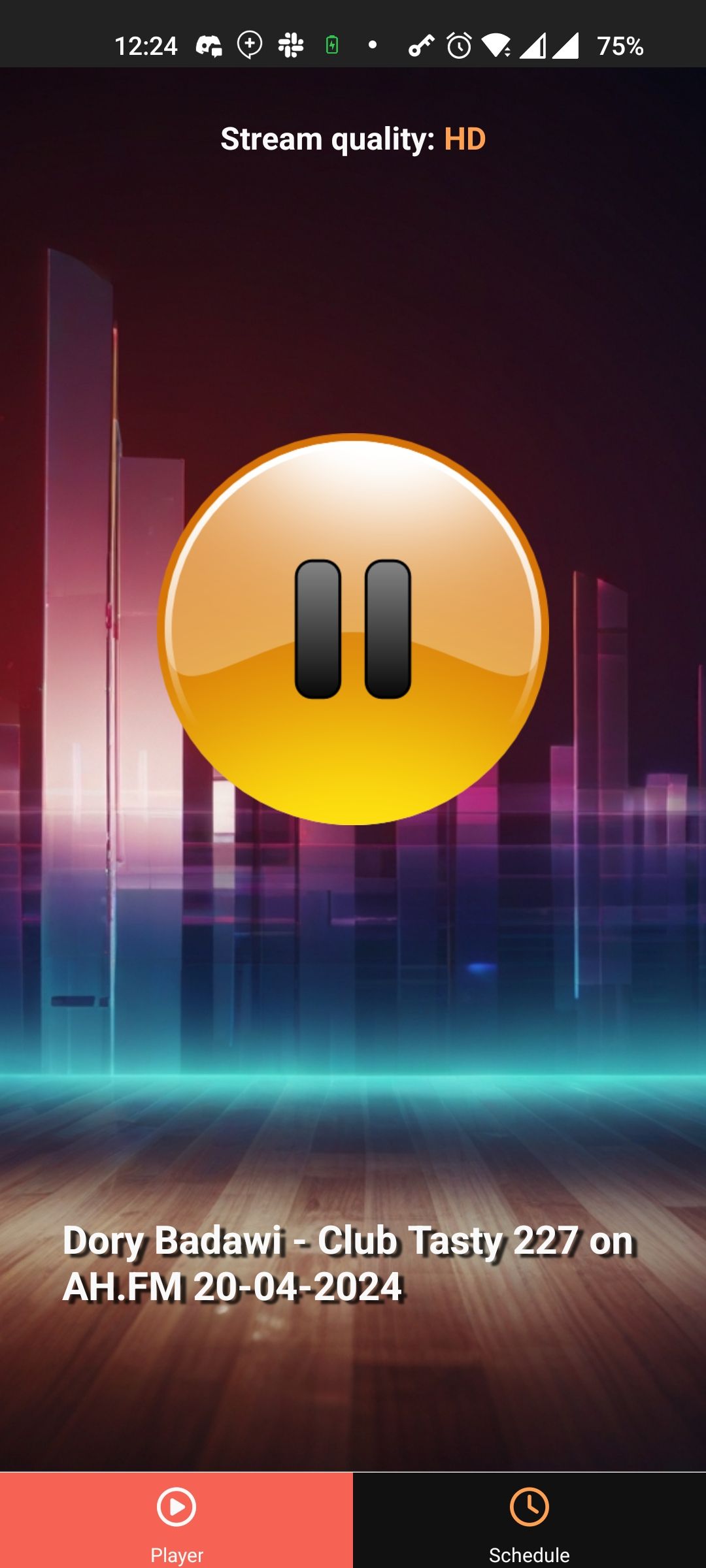
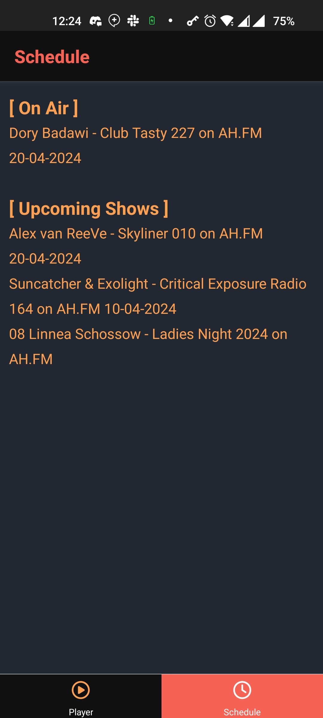
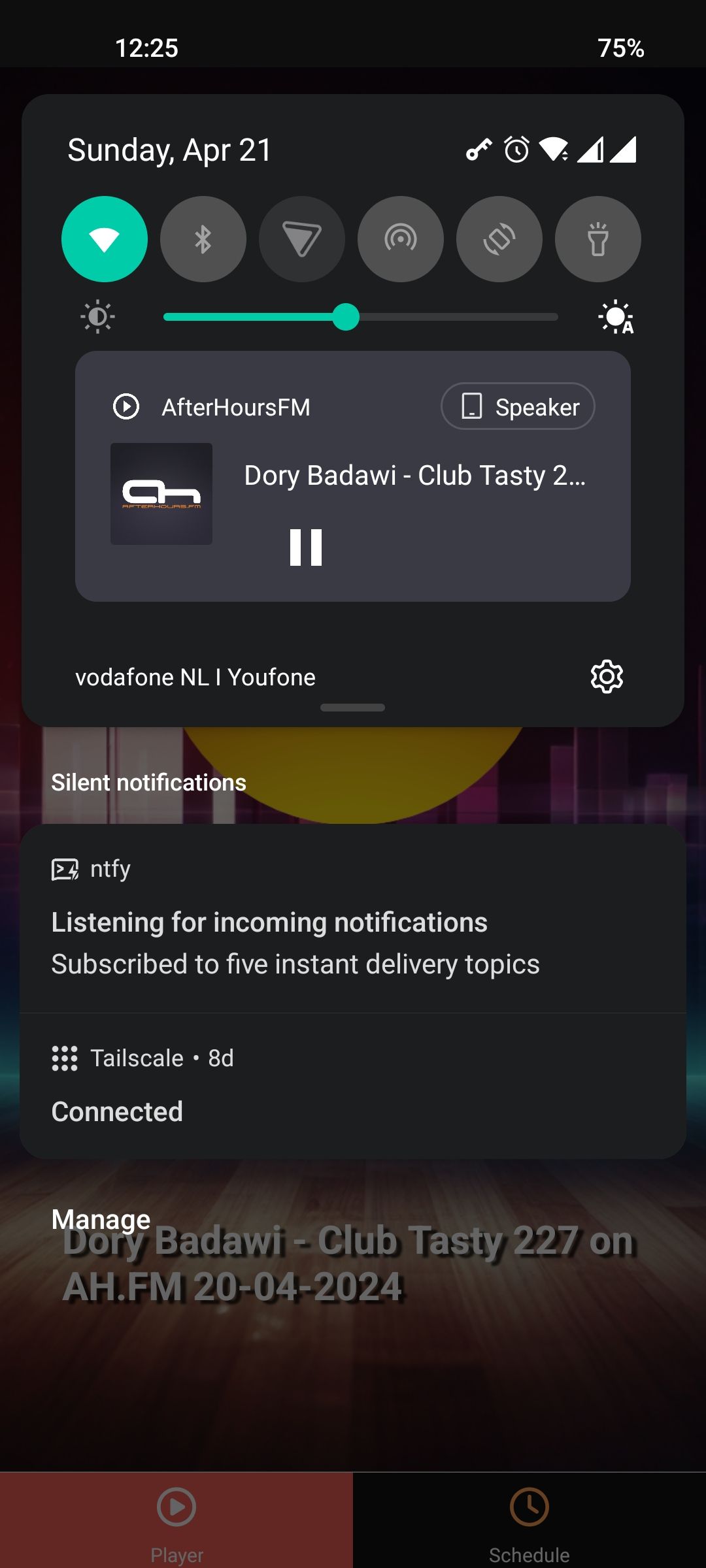
Contacting Afterhours FM
Having an app for yourself is cool. But you know what's even cooler? Being able to share it with the world. I realised that if I add a few more features and polished it a bit more, I could probably release it. But seeing how AH.FM hadn't had an app in years, I wasn't sure if they'd be okay with that, or with me using their name / logo's. And that's without even getting started about the music rights.
So I reached out to their founder Dan through the website, showing him the screenshots and telling him about my plans. He quickly responded telling me they were planning to look into updating their apps this summer and they were willing to work with me to release this as their apps.
Second version - branded
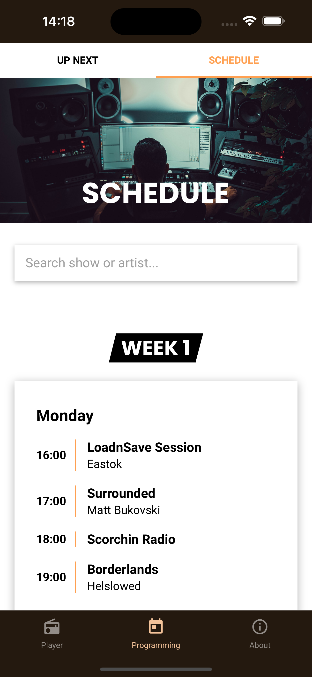
When talking to Dan one of the first things he said was: "Can still update the style a bit?". I responded:"Absolutely!". He also suggested I implement the Schedule, rather than just 'Up Next' and asked about support for Chromecast and Airplay.
Now that I knew Dan was interested, I got even more excited. I had a reason to add even more features and I could see how using their clean branding would be able to pull it all together. A few evenings later I had some spare time and managed to comptely overhaul the style of the app.
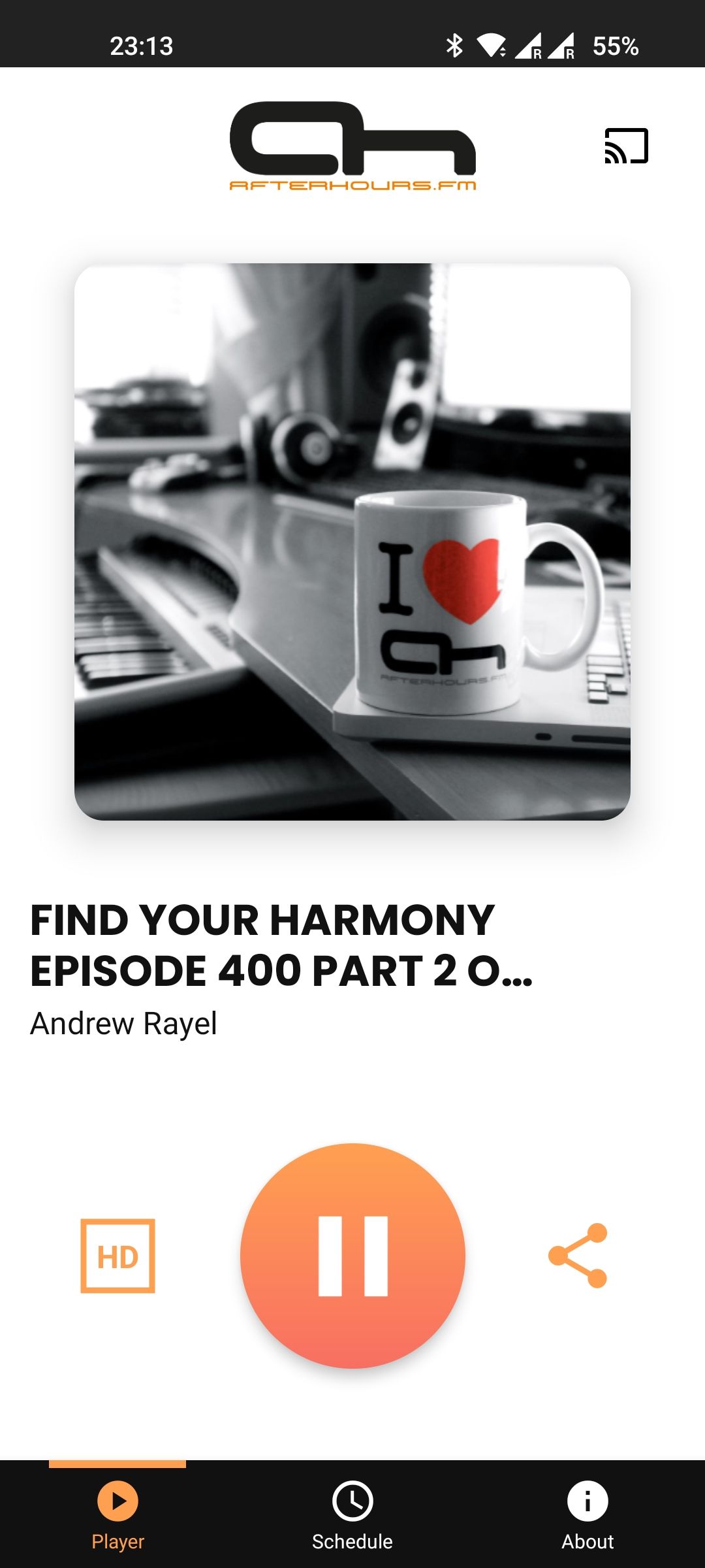
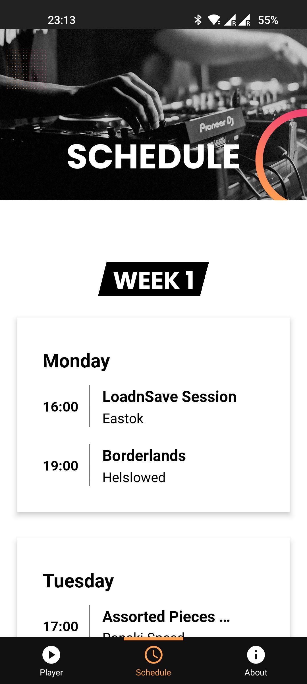
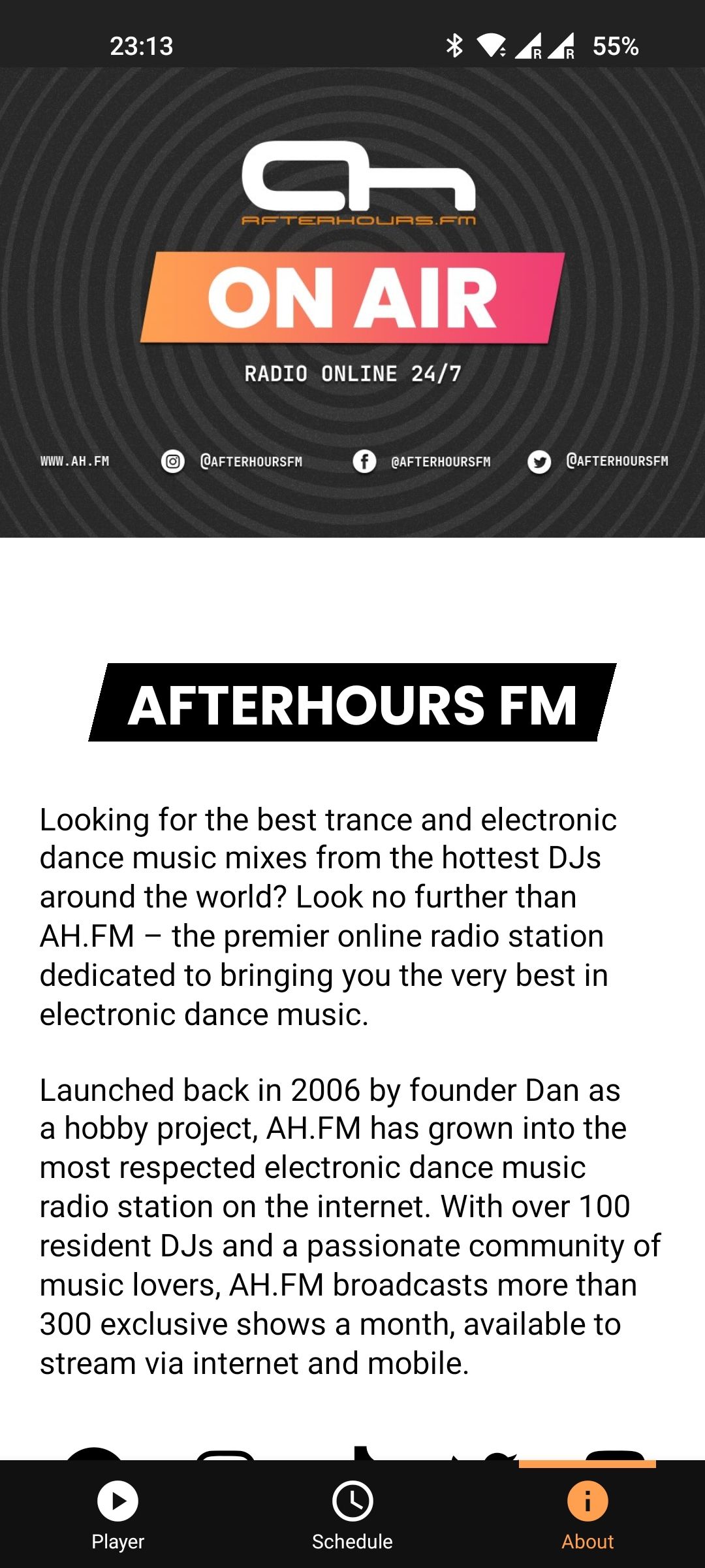
Dan was excited! He loved the new fresh look of the app and couldn't wait to try it out. He however, would have to be patient. I use an Android as my daily driver and he was using iOS. Getting a beta version on an iOS device requires a taking a lot more hurdles than Android... Eventually we managed to get it all sorted out and he got to try the app for the very first time.
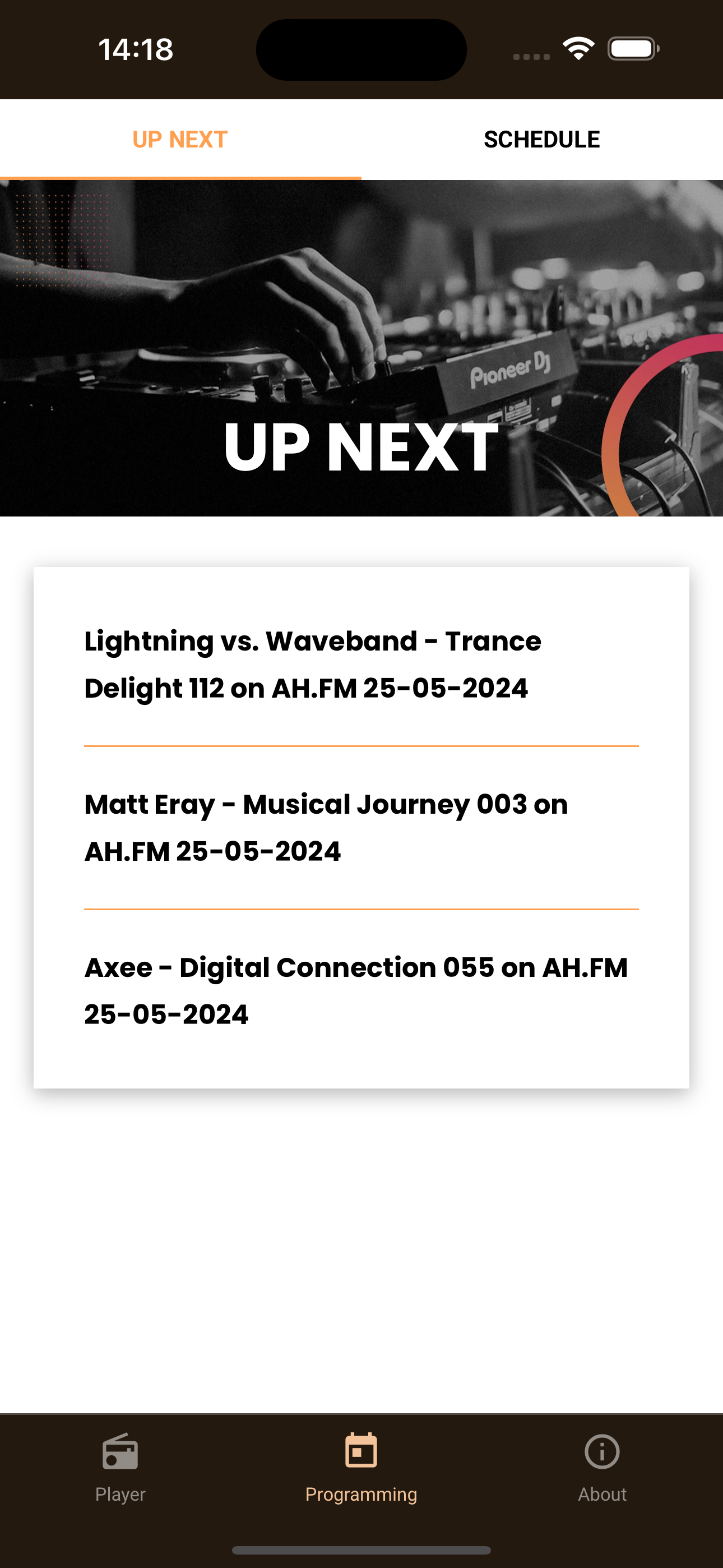
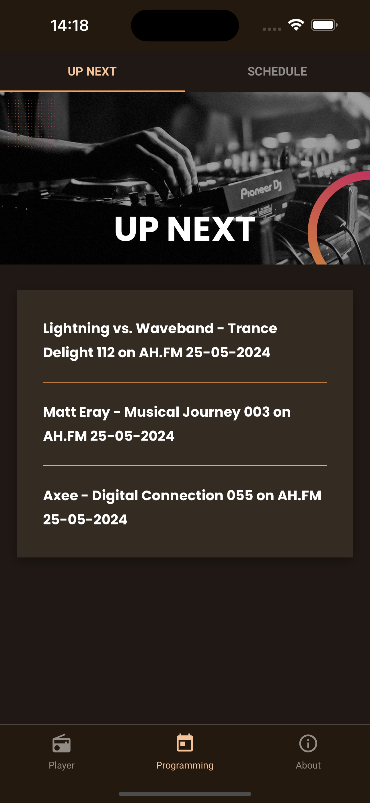
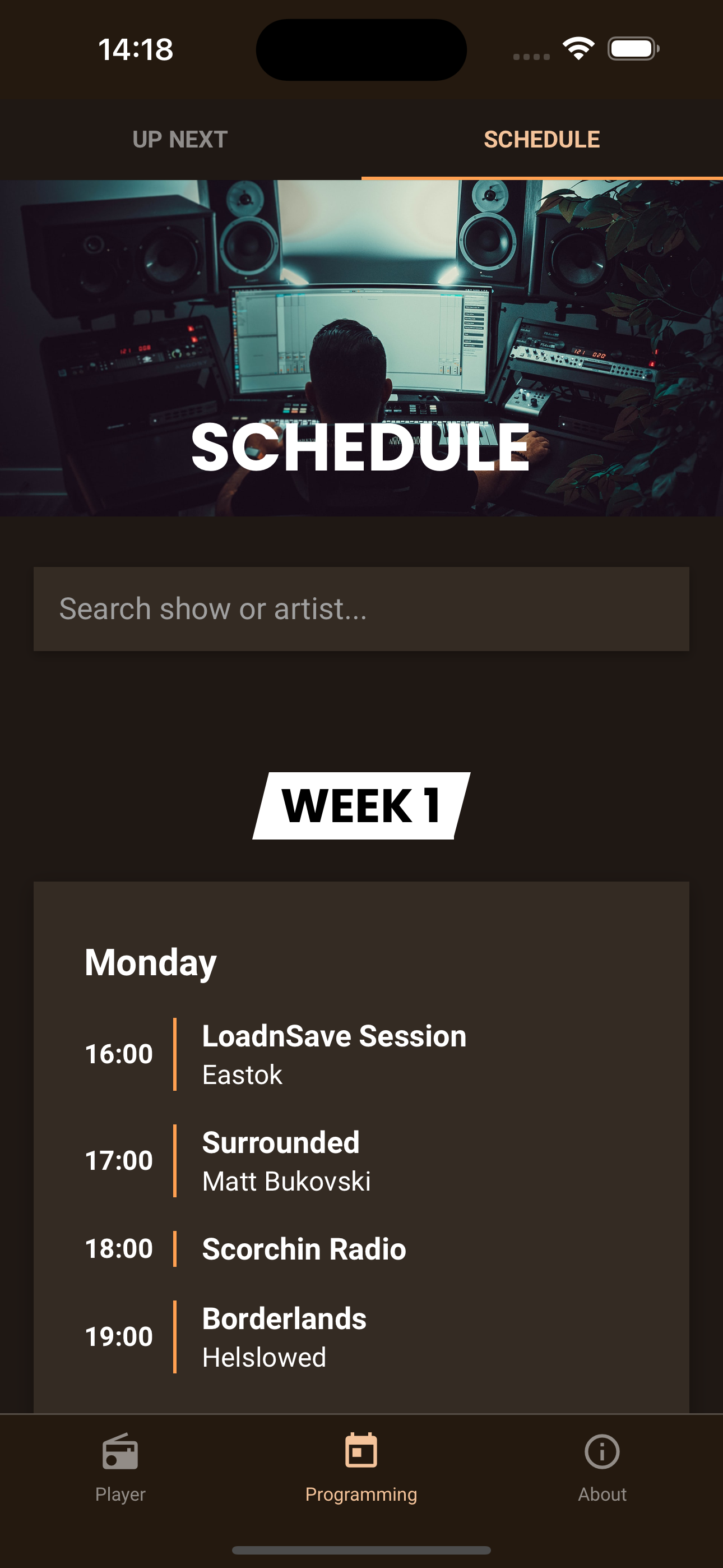
Once he tried the app, he got really excited. He couldn't wait to release it, but did have some feature requests as well as some styling feedback. The play button was a bit to big, the App overall was a bit too too bright (something my girlfriend mentioned as well), the Schedule lacked a search feature and he missed the overview that 'Up next' offered. Along with a request for a dark mode.
Final version - tweaking & dark mode
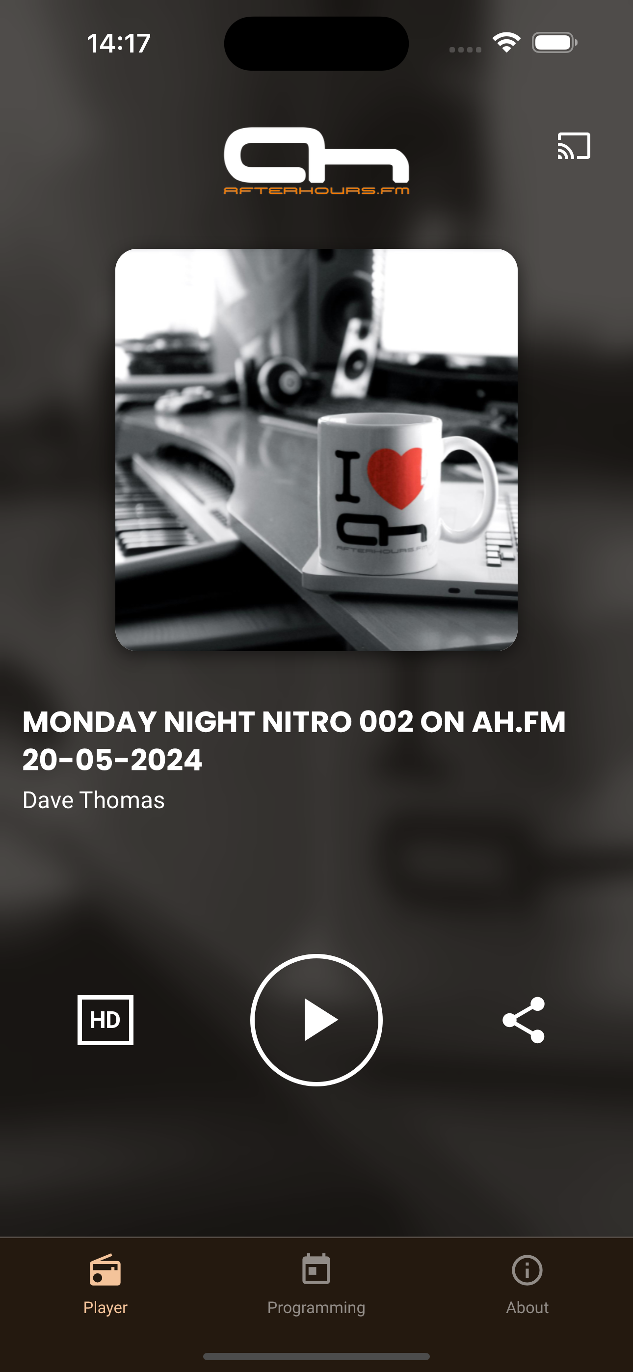
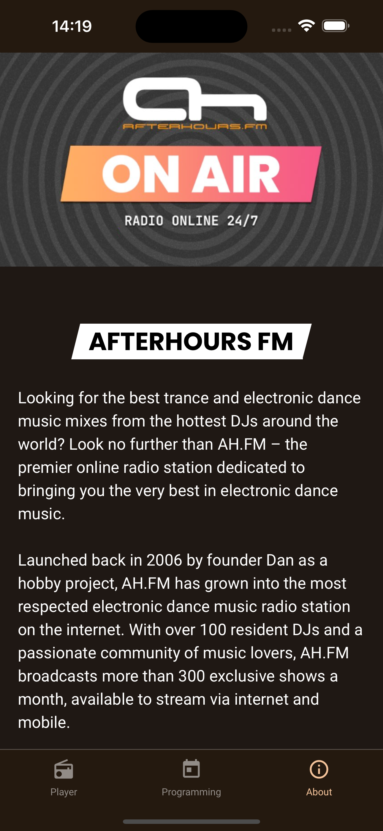
With those featuers in mind I got back to work. Based on Dan's feedback I restyled the player to closer resemble the pop-up player from the website. When just going for plain black and white, the interface got a bit boring. So I darkened the orange color of the logo and used that as an accent for the player and the navbar. I also used the orange color of the logo as an accent for Up Next and the Schedule to avoid those becoming a black/gray wall of text.
As for the dark mode, making the background a dark gray rather than white, worked, but it lost too much soul compared to the rest of the app. So I experimented with making the background an even darker shade of brown than the navigation bar and ended up loving the look. In my head it seemed like an odd choice at first, but the orange accents tie it together.
With all those changes, I ended up with the final version of my very first app: Afterhours FM.
Release and the future
On June 2nd the AH.FM apps were officially released on both the App Store and Google Play for anyone to download. I'm happy to see it has already gathered a few hundred users, all tuning in to the awesome sounds of Afterhours FM. I also want to give a special shout out to a few of my friends who ran app on their phone prior to release to make sure it wouldn't crash on other devices and gave me feedback.
The future will bring more features to this app. Yes it covers the absolute basics of being able to tune in to Afterhours FM, but I'm already working on a feature to be able to play the Podcasts. Not only that, I'm also looking for ways to integrate the Premium Subscription (access to high quality recordings of all shows played on the station since launch) into the app. Both of those features already have working proof of concept and should be coming in the upcoming few weeks.
Until then, enjoy the music!

Comments